Website powered by

Sombra [Early Concept ] | Character Development Project

General / 16 March 2020

Duration: 2 Months
Engine: Marmoset ToolBag 3
Goal of this Project:
The Goal of this project was to create a character in the style of Overwatch to the best of my (current) ability, as well as to create a 3D version of a concept as accurately as possible. I also wanted to focus on texturing, pipeline methodologies, and re-acquaint myself with Maya's rigging and skinning, as I find it produces a higher quality than 3DSMax's Biped.

CONCEPT [BREAKDOWN]

For this, I didn't have to take the time to concept, which allowed me to spend more time on the character creation side. I went through a few character concepts from the Overwatch art book before settling on Sombra's early concept, as it had enough detail to demonstrate further skills beyond Organic sculpting, but wasn't an overload for the amount of time I had to complete it. I gave myself a time limit of two weeks to finish the creation process, much like an art test, and to see how much I've progressed working under time limits and turnaround times. 

What I really enjoyed about this concept was the shape language used in her silhouette, as well as the theme of sharp points throughout the design. I also enjoyed the color schemes, although I can see why it wasn't used given the art direction of Overwatch (this made it a little hard to accurately compare if it fit in with the Overwatch style).
DEVELOPMENT

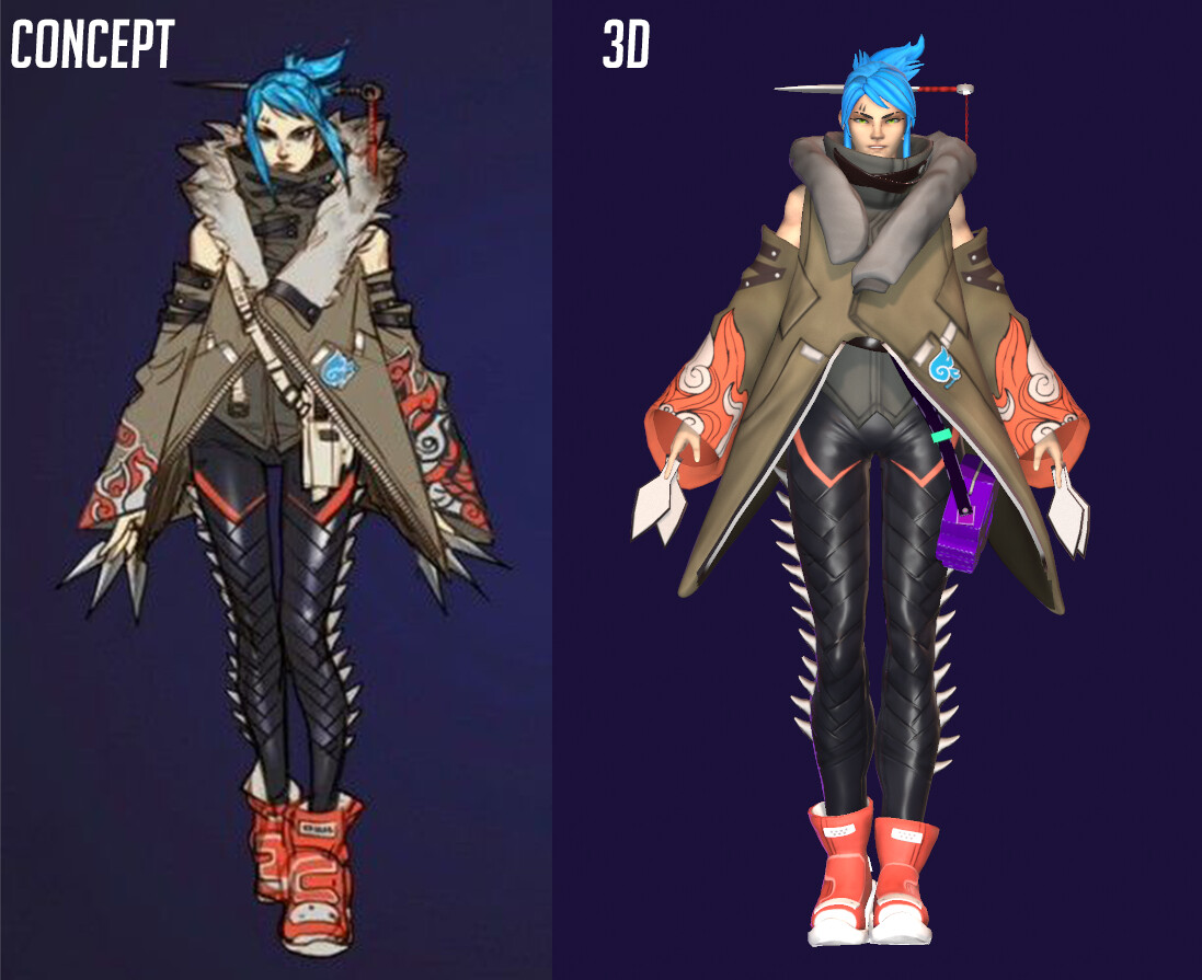
Starting the character creation process was easily my fastest for this project, as I've been practicing creating characters for two years now, all from the ground up (since I have the time). I took careful measures to use as much existing Overwatch resources as I could find, including the character High poly renders from the team, as well as rips of Character models that people have posted on RenderHub as reference for accurate posing, proportions, and heights. 
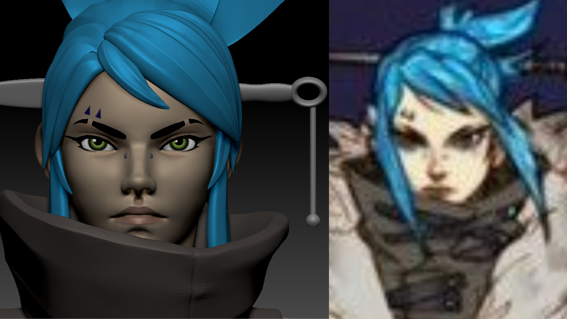
It was a bit of a challenge to fit my version of Sombra to the official version, just given how her model was angled, whether or not there was perspective on it (and what the FOV was), and just general skill level differences between a senior developer and a junior artist. It was also a little bit of a trip-up using Sombra's official face as reference, when her concept looks vastly different. I think I wanted to keep some similarities, but that also started to suffocate my process, so I eased up on trying to make it look like the Sombra we've come to know. 
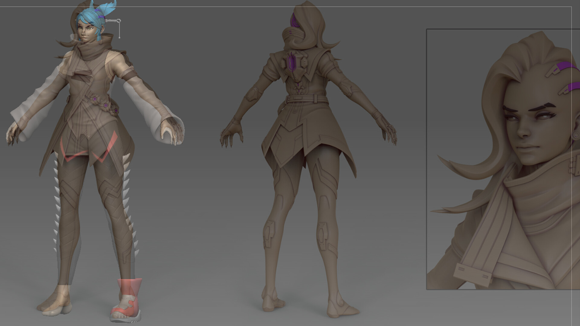
It's a little "taboo," but I didn't spend terribly long on getting realistic anatomy, as about 80% of the body was going to be hidden anyway. I wanted to focus more on the proportions that Overwatch characters are known for - long legs, pretty faces, slim waists, etc.  

I also used a ripped model of D.Va from RenderHub to get the finger positioning as accurate as possible, as I noticed that Overwatch characters have their fingers in a very specific positioning (probably for the sake of holding weapons). I also couldn't tell if D.Va just had a really big head for visibility (given she's in a Mech and TINY when she's out of it) - I probably should've used another character like Mercy to crosscheck even further.

I also really wanted to focus on my topology, and try pushing it a step further if I was able to - I really wanted to break past the art plateau that I've been on, and I think I managed to accomplish that, even to a small degree, and set a higher standard for myself for future projects. 

I also made the choice to duplicate her head, and turbosmoothe it to a higher polycount for a smoother silhouette. I still haven't figured out how to make a clean, smooth silhouette with fewer tris as I often find that the ears look really bad or things don't look as crisp as I would like them to (I know that it is possible, I just need to keep practicing). The only reason the above face topology looks good is because it was set on Maya's smoothing preview, and it didn't translate well when I took it into 3dsMax for UV unwrapping. While I like the results of turbosmooth, I wish it had more control for the amount of loops and tris it gives. I also would love to clean up the area around the mouth, but deleting certain edges created n-gons. 

For UV unwrapping and texturing, I really wanted to get all of the character aspects on one map. Unfortunately, I didn't succeed with that, but I do think that my packing has improved. I also couldn't figure out how to change the texture size to a custom 2048x1024 (heightxwidth), otherwise I think the body and jacket textures would've fit on one that way. I used the files from Widowmaker's ripped model as references for how many texture maps she had. 

Additionally, I had wanted to use Marvelous Designer for Sombra's jacket, but found it easier to sculpt it in ZBrush, which also helped speed up my workflow and time, as I didn't have to fight with patterns not laying properly. I also changed the purse that she has in her concept to Sombra's trademark skull as a small homage to her official design, as I thought that might be a fun little detail. 

For Rigging, I didn't want to use 3DSMax like I've done on past projects. I find 3DS tedious and frustrating, despite it being easier to understand (personally) for weight painting. As rigging and skinning were not part of my goals for this project, I used Maya's HumanIK rig and adjusted it as needed, and used the default Bind Skin settings without additional weight painting. This is only for MY project's purpose, as I just needed to pose her to the concepts pose. 
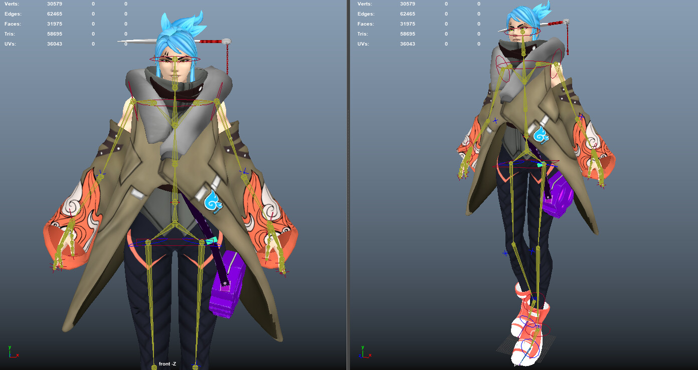
Here are some GIFs of her default rig/skin combo and how they deform nicely even without tweaks. (The floating objects were added back in to the static posed version - Teeth). With proper weight painting, I think this character will be fun to use for animation projects later on. 

PROJECT POST-MORTEM

What Went Well:

  • Character High Poly sculpting process - having done every character from the ground-up, I have gotten very good at creating base sculpts quickly
  • Retopology - I always do retopology, even though Remesh exists. I find that it's cleaner and has better control for deformation
  • Unwrapping - I've gotten used to unwrapping organics, and while i have room for growth i feel that i've come a long way from where I started
  • Keeping to my self-directed schedule

What Went Wrong:

  • UV layout - I so wanted to use a 2048x1024 vertical like I've seen on some Overwatch characters but I had trouble understanding how it applies to a 1-1 UV space
  • Facial Rig setup - I had actually wanted to play more with facial rigging using FRigger (I am not a tech artist by any means) but had trouble with the weight painting in Maya (due to unfamiliarity and lack of training)
  • Marvelous Designer - this was more frustrating than I imagined it to be, as the triangular nature of the coat didn't want to sew how I wanted it to; just a learning curve to practice on

For Next Time:

  •  Better familiarity with Maya's weight painting system
  • Familiarity with patterns in Marvelous Designer
  • Taking the time to skin the character fully for total completion of a character pipeline
  • Better UV space usage for certain maps  

Ellie Green | Character Development Project

Making Of / 27 February 2020
Duration: 2 Months
Engine: Unreal Engine 4, Marmoset Toolbag 3

Goal of this Project:
The goal of this project was to create a character from the ground up (written description to concept art to final Game-res model) as well as a companion environment with set-dressing that would help tell a slice of a larger story. 

[This was actually done for a class assignment, but the purpose of the class is to help supplement our portfolios with things that we actually would like to be doing in the industry.]

CONCEPTING

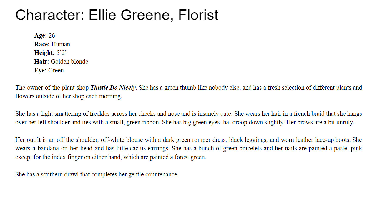
Ellie Greene is actually one of my many NPCs from my DND Campaign that takes place in a Dishonored-esque, steampunk inspired world called Eladria, where the world has been fragmented due to an excess of magic seeping into the world years before an event called The Great Corrosion happens. I created her to have this sort of bright, happy presence in an otherwise sleepy town (Ivorfell), where she was born and raised and now lives indefinitely. 

As you can see, some of her outfit design changed during development, as she no longer has a white blouse on underneath a jumper dress. I actually did sketch a version where she had her jumper dress on, but it felt a little juvenile and also didn't look as good with her apron.

Below are the quick concepts I did before jumping into the character creation process. I didn't want to spend a long time on concepting full ideas, so I settled for quick thumbnail explorations. I think this was also expedited because I had a familiarity with this character before deciding to turn her into a 3D project. 

FLOWER SHOP

For Ellie's shop, I really wanted to convey a sort of bright, uplifting ambiance that would mirror and reflect Ellie's personality without being blatant. I really enjoy visual, environmental storytelling as I find it a fun way to extend a character's personality as well as display a breadth of modeling skills on a more technical side.

I'm really enamored by the little shops that are seen in Europe, as they have a very rustic traditional feel about them. They always feel a little big magical whenever I see them. Mostly, I wanted to have a variety of things that a normal plant shop would have, but since this is also DnD, I figured Ellie would also sell to mages/sorcerers/etc. and would have herbs and ingredients that are commonly used such as lavender, ginger, and mushrooms. 

DEVELOPMENT

For development, I started with Ellie's character sculpt, as that was the main priority of my project. I also knew this would be the fastest piece for me, since I'm much more familiar with characters than I am with environments/props... or rather, I much prefer doing characters than environments and props. I do think it's safe to say that I really found a way to enjoy all of the prop modeling I had to do for this project when I stopped thinking about it as an assignment, and as a piece for myself. 

ELLIE GREENE

With Ellie's sculpt, I really made sure to gather reference beforehand instead of during or after, like I've mistakenly done on past projects. This project and this character was a chance for me to really start implementing some feedback that had been given to me about my work methodology, such as rushing a character simply to have a portfolio piece faster. I really wanted to take the time to focus on this character, and make sure that the sculpt was as clean as I could get it (without sinking too much time in, knowing I had a variety of other tasks to do before the delivery date). 

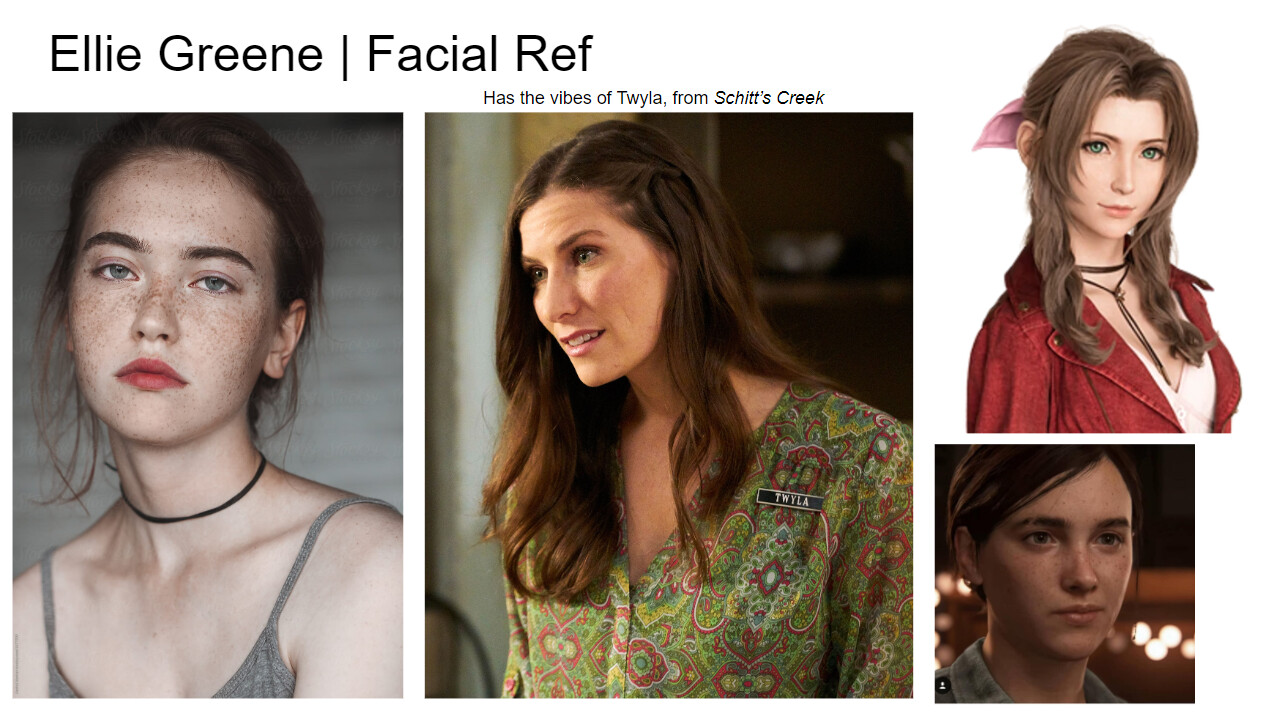
I gathered a small but efficient number of reference photos from Google as well as from various other media (Schitt's Creek, Final Fantasy VII, and The Last of Us II) to serve as a reference for Ellie's face. In her description, she has these sort of big, perpetually sad-looking eyes and really thick brows, and I wanted them to be prominent and not understated. She's a florist, and I don't think she would spend too much time on grooming her appearances, and would instead embrace sort of her natural beauty - as cliche as it sounds. 

I also really wanted her to have a more square jaw and prominent chin and nose, as most cute-sy girls like this are very cookie-cutter with a button nose and wide, almond eyes and a heart-shaped face. Don't get me wrong, I really enjoy that character trope but I also really like when characters are diverse and don't suffer from Same-Face Syndrome. 

For her body, I didn't really focus on actual anatomy as much as I did on getting proportions and the bony landmarks where they needed to be. I also didn't attach her legs to her body, as I only needed them for Marvelous Designer. Her dress covers about 60% of her body, and it seemed a waste to have extra geometry that wouldn't even be seen. Since this is only a character vignette, and not something for film/animation, there was no need to have a full body for cloth simulations, otherwise I would've kept her leg geometry. In order to speed up the sculpting process, I also used individual basemesh limbs that I created for a past project that was the start of an anatomy study but never got too far, so it was nice being able to refurbish some of my older work for this piece. 

I also wanted to try and focus on detailing the hands more, as they have been a huge weakness/afterthought on my previous characters. There's still a long way to go for me in terms of hands, but progress is progress, is progress. 

I also really wanted to go for that sculpted hair feel that I've seen stylized games use a lot, instead of doing hair-cards (I'm still learning how to groom hair and have it actually look good). It was actually really enjoyable to do sculpted hair instead of having to place haircards, and I think it worked well for this project's purpose and aesthetics. 

I also still do my retopology by hand, instead of relying on the decimation tool in ZBrush. I find that it helps keep my skills sharp and also adds that extra carefulness towards tricount, edge flow, and deformation for animation and posing. I also just like having really clean topology when I can, and retopologizing my model gives me that kind of control that I like to have in my work. 

I especially like retopologizing my character heads, which probably comes from my animation background, where our main focus was always on deformation around the eyes and mouth. I also think that in presentation, it looks much nicer than what ZBrush can give you. It's also just a really nice, mindless task that you can do and it really helps me feel like the character is mine.

This was also my first project where I really used Marvelous Designer and brought it through a pipeline. Marvelous has been a bit of a hit or miss for me, simply because I have no formal training or any advanced understanding of pattern-making. I found it to be both freeing and daunting to create a whole outfit in Marvelous, rather than painstakingly sculpting and finagling with subtools in ZBrush to make the clothing. It actually turned out much better than I was expecting, if I'm being honest. The only thing that didn't really work out was the bandana, 

This was also my second time to model/sculpt shoes for a character, and it's definitely still a major learning curve for me. I haven't really had any proper/formal introduction or practice modeling shoes, but I would love to get better with time! I actually set the base for these boots up in 3DSMax, using the Line tool and a reference pic instead of building them in Marvelous like I've seen some artists do.

UVs and TEXTURES

UVs and Textures are one of my weaker areas, as in past projects I kind of use texture space how I please, and without really thinking about UV efficiency in a realtime context. This is definitely something I'm trying to be much more mindful of, especially as I go into the job search.

While we were given restrictions for two texture maps for the characters for our class, those were taken from an FPS game. I referenced Overwatch more than anything, which often allows for three or four maps. For Ellie, I probably could've fit everything into one map for her clothing, but I also didn't want any of the painted details to be too blurry if I went with a smaller texile density. 

I actually had to repack Ellie's body map, because it was originally done as separate meshes across two different Unwrap sessions and I couldn't justify having a headmap that took up such little space, and with a majority of the body left, I couldn't justify giving it it's own map either. Thankfully it was just a matter of moving the textures after merging the UVs to one map. 

For her clothing, I gave her one 2048x2048 texture map for the larger details like her dress and apron, and then another 1024x1024 map for smaller details like her shoes, bandana, and her props.

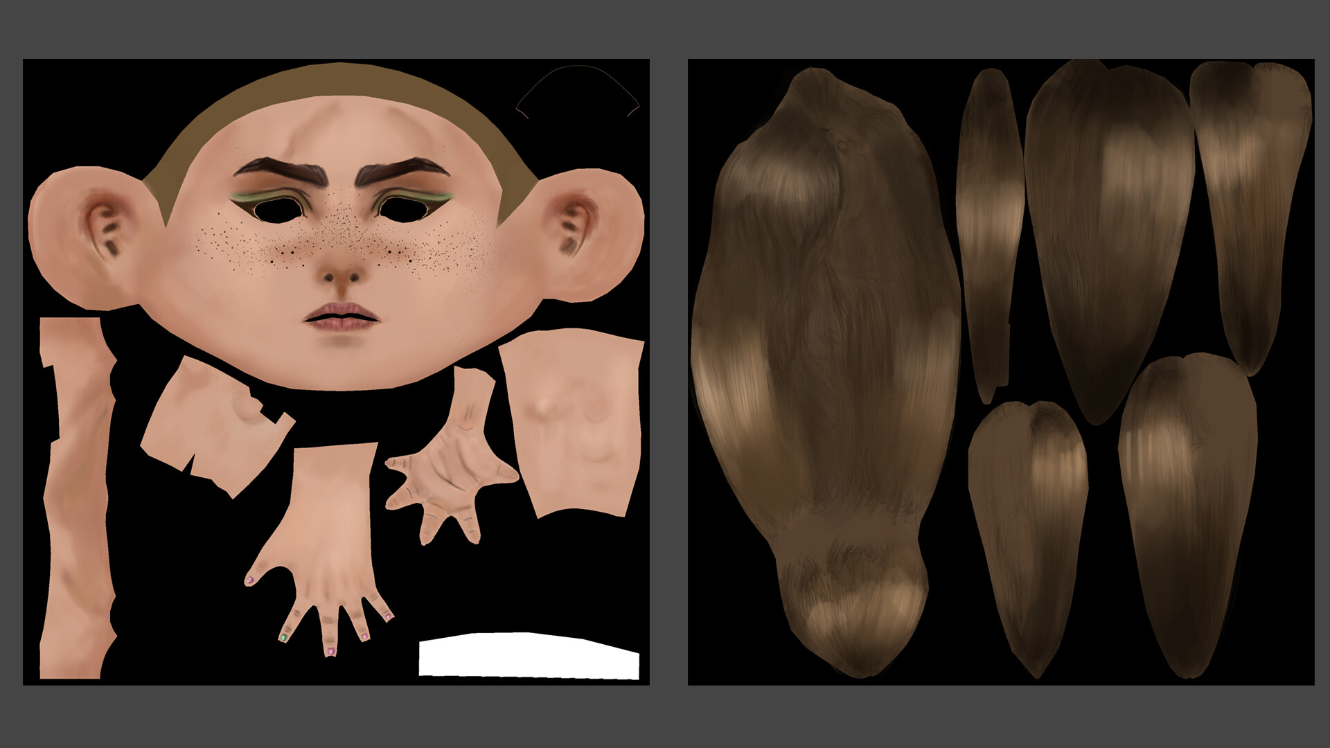
For the actual texturing, I use Substance Painter to lay down the base colors and so I can hide my seams easier. After doing initial shading for everything, I export my texture maps and composite them in Photoshop, as well as edit them with softer brushes that Substance is more finicky about. (This is the first pass of textures, and my primary focus was getting the head to look nice more than the body, which was deleted anyway)

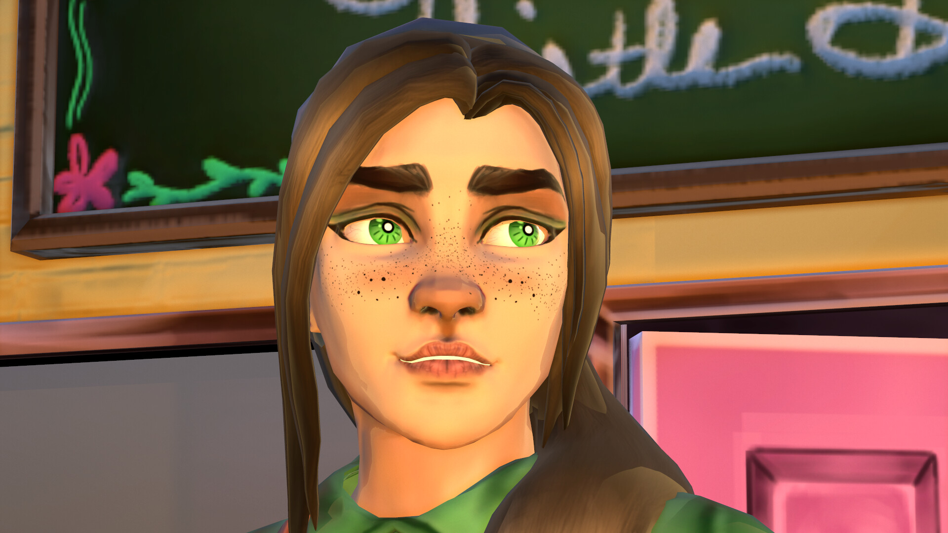
This is the edited head textures done in photoshop with a soft airbrush, to kind of help further blend things than in Substance. I also added shadows where her hair bangs hang. so that there was some more added depth. I also upped the amount of freckles that she had, based on some feedback from a few of my peers, who suggested to really push that aspect of her features. 

(Marmoset Toolbag 3 Render) 

'THISTLE DO NICELY' FLOWER SHOP & EMPORIUM

I really wanted Ellie's shop to be an extension of her character and one that would help to convey her personality a step further than what's already presented in her character model. Having already written descriptions for Ellie's character as well as her shop for the campaign, it was fairly easy to envision what it would look like. I didn't want to do a full environment, because that wasn't my focus, and would've also been too overscoped for this project. It also would've taken away from the focus of Ellie as a character. 

I wanted to keep Ellie's props fairly minimal, but expressive of what her shop has to offer. I think that, if I had had more time for this project, I would've done a much larger variety of flowers, to really feel unique and picked with care. I'll probably go back in once I'm out of school permanently and do that anyway. 

SHOP TEXTURES & UVs

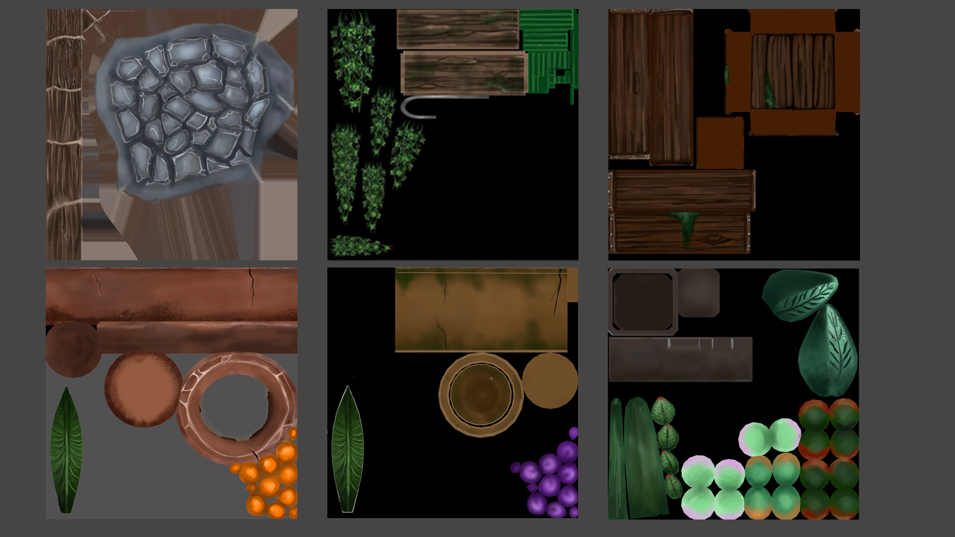
For Ellie's shop, packing all of the UVs was a much easier task and much easier to compact them all together. Since they all act as a set, I wasn't hesitant to put everything together, and ended up with at total of three texture maps for the entire environment. 

Unfortunately, there were a few things that didn't fit, so they were separate, standalone textures. I probably could've packed them more efficiently, so that's a learning point for next time. 

I definitely could've been more methodical with my UVs, especially for the potted plants. I think if I go back and make changes, I will probably move the potted plants to the Hanging Vine/Plant stand map (center top)


R.E.M. | Team Game | Development Breakdown

Making Of / 27 February 2020


GAME: R.E.M.
COMPANY: SMU Guildhall
ENGINE: Unity
PROJECT DURATION: 16 weeks
DEVELOPMENT TEAM: 5 devs

Game Designer: Chris Kim
Level Designers: Chris Kim, Bethany Yao
Artists: Julia Corsi, Lamesha Coley
Programmer: KZ Zhou

Stakeholders:  Jeff Cavitt, Eli Luna

Description: 
R.E.M. is a 2D puzzle game developed for the Samsung Tab A

------------------------------------------------------------------------------------------------------------------ 

My Responsibilities:

  • Organized the Art Style Guide and Visual Development documents during production 
  • Communicate with GD and discipline members
  • Collaborate with other artists on assets and animations
  • Assisted with asset implementation in Unity
  • Communicated with Level designers for puzzle aesthetics
  • Communicated with other artist for deadlines and divvying of tasks
  • Communicated with programmer for certain aesthetic functions (animations, etc.) 
  • Received feedback on assets and implemented changes as necesary

CONCEPT PHASE

During our planning/concept phase, I volunteered to act as the team's unofficial art lead, since this was our first team game and working together was new for all of us. For this, it wasn't a monumental task, as we were only a team of five developers. Before even doing any development, our entire team spent a few good days doing brainstorming, trying to keep scope and feasibility in mind.

We didn't want to create another platformer, as that was what the other teams were doing, and we had certain parameters that we needed to follow for production. So we settled on a puzzle, and looked at the puzzles from Bioshock as inspiration.

VISUAL DEVELOPMENT

Having had experience as an art director during my Undergrad Thesis (Tales of the Arukigami), I offered to set up our teams visual development direction during concepting. Steampunk, at its core, was not something that I was super familiar with beyond a basic bastardization of it from literature and other media, so actually having to work within its aesthetics and parameters was an exciting new journey for me as an artist. Since we were such a small team, I wanted everyone to have some sort of input on what went into our visuals, so everyone contributed to the visual development document in one way or another. 

VISUAL DEVELOPMENT DOCUMENT
https://docs.google.com/presentation/d/11cftU-LfA2MQO_MzqZ0l89Mnb-WiI28qt-ECdCnKT9w/edit#slide=id.g4291b37dde_0_17 

PRODUCTION PHASE

During production, we took our puzzle concept and pushed it even further. In order to fit with the pipes theme, we settled on doing a Steampunk-themed game, where the player had to fix broken machinery through the use of their player drones. 

The setting of the game takes place in an abandoned steampunk city called Ashburrow. You take on the role of REM, a repurposed war robot, and repair the broken machinery as you traverse the city. The narrative mechanics of the level backgrounds affects the state of the Level Select Screen, which slowly begins to light up as you progress.

For the level select, I wanted to make it sort of a linear narrative progression that would both make sense to the player but also look clean and refined while conveying as much information in a limited space as possible. For my first iteration, I had the idea that each node (circle) would show a small piece of the machinery that the player was fixing in that level/section of the city. Before completing the puzzles within that node, the image would be dull and grayed out. After completing all puzzles within that node, it would light up, and a trail of light/sparks would travel to the next node. Since our game had a sequential, hinted-at narrative, I designed the background as a condensed sort of map: the brass fence serves as the entrance, and the power generator section, the mid section is the city itself (the levels that corresponded were repairing the water and electricity), and the final section up top is the clock tower, which is the final stage of the city's repair. 


Ultimately, the team's (and myself) had the same concern that it would require too many puzzles that the level designers wouldn't be able to complete with our time constraints, so we settled for the final iteration, which both achieved a similar idea behind the initial concept as well as better convey to the player that they were putting the city back together again.

For the levels themselves, we all wanted to try and integrate the puzzles into the background (and vice-versa) so that we didn't have to deal with having ugly borders around the puzzles. For the puzzle layouts, my main focus was to create an appealing and easy-to-use UI that reflected the Steampunk theme of our game. My other artist, Lamesha, and I did a few brainstorming sessions on how to integrate the puzzle nodes with the background. [Please see her works for her concepts! [Lamesha's Portfolio]]

PUZZLE NODES

Ultimately, we went with the idea of using bolts/screws/rivets to serve as the puzzle nodes, to further fit in with the industrial/steampunk machinery vibe we started to lean into during development. 

The puzzle nodes themselves went through a few stages of iteration, mostly so we could find the most visually pleasing middle ground with them as possible, that looked good but also didn't take up too much space on the screen. 

We first went with the nodes in the 2nd, 3rd, and 4th column, but found that they were too big, and took up too much space or didn't fit nicely within the screen space. Thankfully I designed a variety of options for our level designers to choose from, and I didn't have to design new nodes on the fly. 

BACKGROUNDS

Each background seen in our game represents a different part of the city of Ashburrow. As a team, we decided that we should try and work a narrative into our game in some way, even if it wasn't a direct narrative (due to time and scope, as well as the nature of our game). 

STAGE 2 BACKGROUND:

 For each background we had, the team and I wanted to convey a story through visual narrative. The Stage 1 background is the power generator. Upon completing each puzzle within this stage, the power is restored in Ashburrow and the player can progress

STAGE 2 BACKGROUND:
The Stage 2 background is the boiler. Upon completing each puzzle within this stage, the water system begins to run again.

STAGE 3 BACKGROUND:
This was actually a paintover of the original version (concept remained the same) that Lamesha drafted and cleaned up. Due to stakeholder feedback that it didn't match style consistency, and she was in charge of all of our sprite animations, I asked if it was okay for me to do a paint-over, since I would be able to do it quickly.

THE CHARACTER(s)

Given the nature of our game (Puzzle), there wasn't a lot of room for any legitimate instances of the character, REM, so we settled for using his Drones as the main characters in gameplay. We built this whole little narrative around REM and his drones, which I think helped ground the purpose and intent of our gameplay to a helpful degree - we weren't creating without purpose, and I think it added a smidgen more personality into our final outcome. 

Without further ado, meet REM - the unseen main character of R.E.M. and the role that the player takes on during gameplay. 

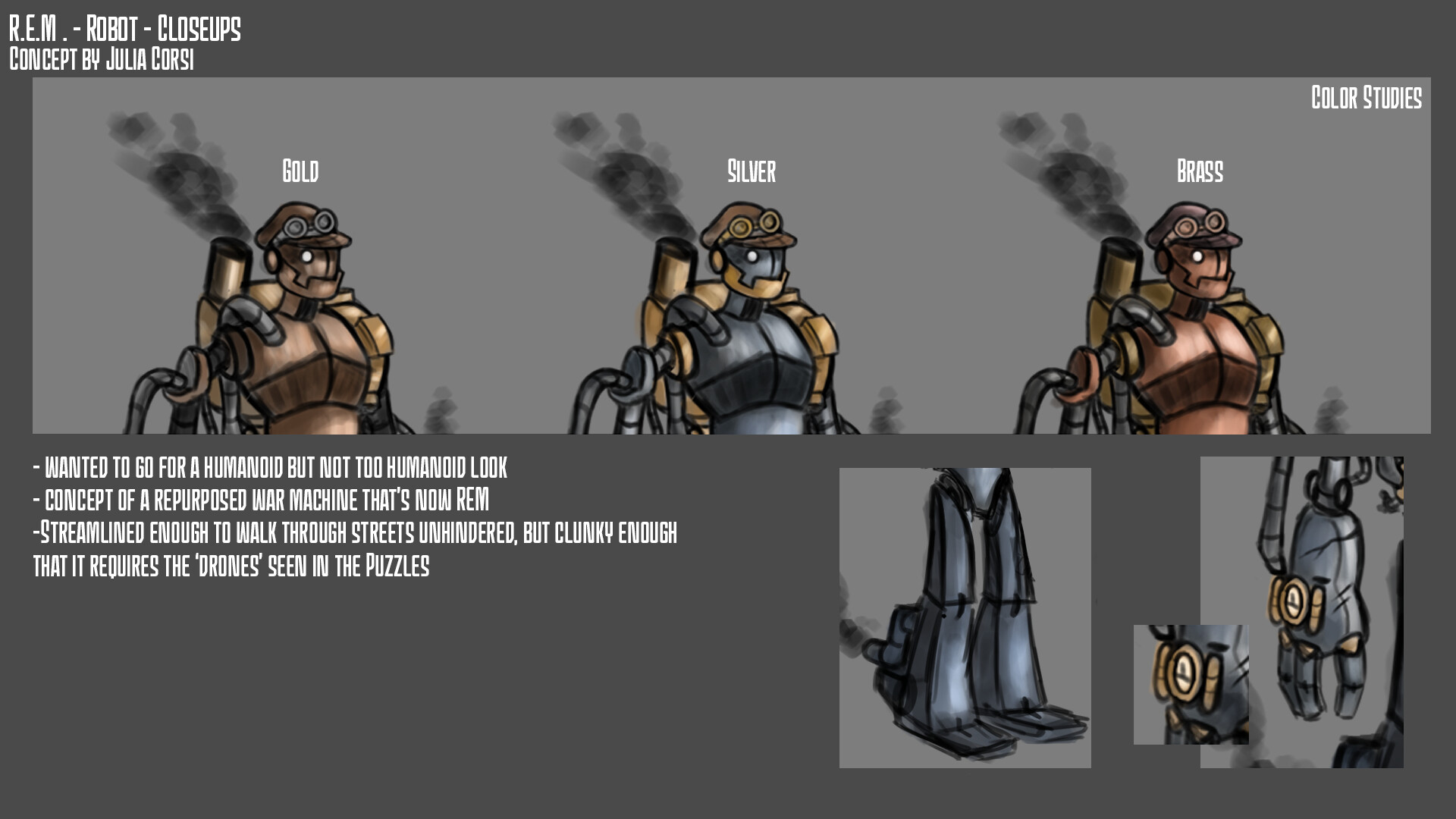
I think it was me who pitched the idea of having a "Player character" even if the player never actually saw him, as it put into context why we were controlling our little Drones that repair the machines. When designing REM, I wanted to have a sort of clunky, cobbled together feel about him without actually being made from scraps. After all, he was once a war machine, and I figured those would have come from someone with money.

I referenced Yoko Taro's Nier: Automata frequently when designing REM, as he did an amazing job with getting that industrial machine feel with the Machine Lifeforms that you see in-game. I also wanted to give REM that sort of Victorian-era newspaper boy feel with his hat and goggles, and I personally think it adds a decent amount of charm to his design as well. 

I really loved the clunkiness of the Machine lifeforms, and wanted to capture that sort of shape language in Rem. His huge hands also contributed to the use of the Drones, making them a necessity to fix machinery. I imagine them to be somewhat clumsy, with a sort of Baymax (Big Hero 6) feel about them. He's clumsy but he's doing his best. 

As for the drones, Lamesha handled most, if not all, of the design iterations for them. I simply offered some feedback and suggestions along the way. [VIEW HERE]

ANIMATION

I only assisted with completing one set of the Drone's animations to help Lamesha with her workload, as she was responsible for 98% of all animations seen in our game and had more familiarity with pixel art animations in context of a game than I did. I didn't want to have a hand in everything, as I thought that would be wrong, especially on such a small team. 

The only animations I helped with were the 'Crash' animations, which play whenever the drones collide paths with each other. It was a fun little dip back into my roots (Digital art and animation) and animating in a pixel style was new to me, so it was a fun little experience to have. 


This was also my first time working with sprite sheets, as I had never had a reason to work with them let alone familiarize myself with the concept of what they do. Thankfully, Lamesha was able to provide assistance for me and taught me something. 

PROJECT POST-MORTEM

WHAT WENT WELL:

  • Communication between all members of the team went very smoothly and the dynamics were quite favorable
  • Staying on task consistently for all members of the team - everyone did their jobs diligently and nobody slacked off
  • Artists were very compatible and agreeable, and knew how to play to their strengths and overcome weaknesses
  • Understanding of keeping scope manageable was important to EVERYONE
  • Level designers did an amazing job at creating puzzles and their solutions - I mean, they really cranked them out
  • Programmer did an amazing job with Unity and getting functionality for all aspects of the game up and running

WHAT WENT WRONG:

  • Some time management skills for attendance needed some work - or communication when late
  • Some members worked outside of core hours
  • Too many devs in the dev-room (a lot of us had multiple skill sets that sometimes would overlap)
  • Artists didnt have a hand in integration - mostly due to the nature of Unity + Perforce and that the LDs were always in Unity

EVEN BETTER IF: 

  • Professors/stakeholders of the course had more teaching moments during development, instead of being as hands-off as they were
  • Artists had more chances to integrate assets and understand Unity more cohesively
  • More test builds had been done on a more frequent basis
  • We paid more attention to the pipelines we had set up for ourselves

TEX-MECHS | Team Game | Development Breakdown

Making Of / 21 February 2020

PUBLISHED TO STEAM: Feb. 21, 2020

GAME: Tex-Mechs
COMPANY: SMU Guildhall
ENGINE: Unreal Engine 4
PROJECT DURATION: 19 Weeks
DEVELOPMENT TEAM: 16 Devs

Game Designer: Len Medina
Lead Producer: Helen Tang
Lead Programmer: Jake Klinkert
Lead Artist: Julia Corsi
Lead Level Designer: NA

Stakeholders:  Steve Stringer, Martin Sawkins, Doug Service, Claire Bian, Brandon Stephens

Description: 
Tex-Mechs is a first-person, single-player, action-adventure mech shooter where you fight to reclaim the insect-infested wastelands of the alien colony, New Texas. Riding your ranching mech repurposed for combat, you battle alien hoards of insects that are determined to destroy you and your fellow settlers.

------------------------------------------------------------------------------------------------------------------

My Responsibilities (Art Lead, 1 of 4 artists): 

  • Create concept art, texture breakdowns, and callout sheets for the rest of the art team
  • Establish and maintain style consistency across all assets and textures
  • Ensure set-dressing was well-placed and assets were properly used
  • Communicated with other leads and stakeholders on a weekly basis
  • Conducted art-only meetings at the beginning and end of each sprint to check in with my team
  • Maintain the Art style guide and keep it updated with each new addition or change
  • Consistently addressed scope issues in meetings

ART STYLE GUIDE

I created the Art style guide for this game based on the established vision of the game designer, which was to look like Overwatch. However, after assessing where my art team's texturing skills and strengths were, I decided that emulating the painted style of Overwatch would be detrimental to the game, so I compromised a toony look with the Borderlands-esque style that you see in the above images. 

I really wanted to make sure that I was conveying the necessary information in a way that included the least amount of scrolling - when you're in the midst of making an asset on a deadline, I didn't want my artists to waste precious time having to scroll through pages upon pages of documentation. So, I broke the ASG into essentials that they could access easily. 

I also really wanted to place an importance on unified naming conventions and unified art tools. Whether that was achieved in the end, I'm not too sure - we had a lot of content to make and we were severely OVERSCOPED for the entire duration of this project, so we didn't really follow conventions when it came down to it at the end of the day. 

For texturing, I definitely wanted to create a reference for my artists. These were early texture style explorations during our prototype phase during Summer. However, due to a lot of team dynamic complications early on, this texturing style didn't make it very far. It's probably a good thing, as the added amount of painterly detail would've complicated reaching a cohesive style in the end. 

For our enemies, I wanted to provide as much information as I could for the artist sculpting their highpoly models (Erick Rodriguez). I also wanted to make sure that color palettes were cohesive across the board, and created a palette sheet for added accessibility, as our creature modeler is color-blind. 


I also had the joy of having one of our level designers (Yujia 'Max' Liu) as our technical and VFX artist. Working with him to create VFX that would fit in with our game was a unique and new experience for me, so it was nice to learn about that side of the art process. He made things really easy to understand and was very flexible with any demands that came from the game designer.


CONCEPT ART

As the lead artist on this project, I wasn't allowed to work on anything that was considered "critical path." This, however, did not last long. We only had three artists on the developers side of the team, and a MASSIVE scope from the get-go. As lead, I felt it was my duty to step in and assist my team as much as I could, regardless of whether it was on critical path things or not. As such, I took on concept art as part of my contributions to my team. 

Environment concept art is not my strongest, but the rest of my artists were also all character-centric artists, so nobody really wanted to create environment concepts. Our game was very environment-heavy, which was a little off-putting to my team and I.

TONE VIDEO

During the prototype phase in Summer, I decided to help find the tone of the game by creating a tone video - the idea of which I took from Supergiant Games' Transistor tone video. Granted, it's not as polished as theirs, but it helped to get the rest of the team and even the leads on the same page and heading in the same direction. Team cohesion was a significant problem throughout the entire duration of this project. 

The script was written by our team's level design manager at the time, Jaye Garrison-Stuber Weston-Wong. 

It was actually quite enjoyable to make this little animatic. I took a lot of inspiration from Red Dead Redemption 2, as that was the strongest point of reference for Western-set media in gaming. This was done in a single evening, from storyboards to voice acting. 


PRODUCTION 

Production began in late August and wrapped up in mid-December. During production, not only was I responsible for my duties as a lead - ensuring that my team was taken care, of that the other leads got what they needed from me or didn't need anything at all, made sure that my tasks were being taken care of - but also as an additional artist helping to create assets for the team. 

The first order of business was to completely revamp the designs for our enemies - the Crawlers. While one of my artists did a really good job at creating illustrative renditions of two crawler versions, it didn't quite fit what our game designer had in mind. Granted, she also didn't really convey what she wanted, so it was a bit of a guessing game regardless. It was quite hard to tell my artist that we weren't going to use his designs, as one thing that I hate doing is shutting down other people's work. But, it had to be done, and this was the result. 

I wanted to create an enemy that would be easy to spot while traversing the environment in-game. I referenced a few poisonous animals for the color scheme, one of them being a Black Widow spider, with the red and black coloring. I also wanted to incorporate a few iconic desert/western creatures - the rattlesnake, the scorpion, and the beetle to name a few. 

On the 3D side of things, my hand in creating assets was limited. I did not want to take content and opportunities away from my artists, as this was their chance to create assets on a "shippable" level of quality. I only created things that they didn't otherwise have time to do. 

I handled the highpoly and game-res version for this smaller enemy - the Grub - while my creature artist worked diligently on the larger enemy Crawler, the Soldier. 

As the Art Lead, I was also very aware of what was happening on the LD side in terms of environment. This was a huge complication for the artists, as the game designer had the Level design team create four different versions of the terrain throughout development, and didn't settle on one location until it was a necessity. This pushed our work on the environment side back by a lot, but thankfully we were able to successfully get the terrain implemented, thanks for the hard work and efforts of Alex Kennedy.

Early Environment [Early Alpha]

I had a large hand in set-dressing each section of the overall environment, as I wanted to make sure that every asset was placed in a visually pleasing manner. It was a bit of a challenge, as LDs were crunching up until the very end and operated in level streams - only one person could check out streams at a time. Because of this, artists underwent a lot of waterfall, as we didn't want to impede on the Level designers work since they needed it more than we did. Granted, it was still a little nerve-wracking to wait so long to finalize set-dressing. 

This is the Vertical Slice beauty corner that I set up and re-iterated on during production. I had to ensure that it didn't get changed or messed up without my knowledge, as this is the first thing players see after finishing the tutorial section. 

I was also in charge of exploring different HUD layouts that would convey all of the information that was necessary to the player, without overwhelming the screen space or being too difficult to find. The game designer had wanted some of the icons to be integrated into the actual dashboard, but I made a point that the texture space and placement of the mech dashboard on the screen didn't have enough space for these things to be easily seen by players.

This was the second, and final, iteration of the HUD layout. I was a bit unhappy with how the programmers placed the camera, and despite my requests to move the FOV backwards, it didn't happen. The result was a more cramped dashboard that cut off a lot of important details and made the player feel like they were standing over the dashboard, instead of sitting at it.

MARKETING

For marketing, my artists Erick Rodriguez and Alex Kennedy handled most of it. Alex created the poster(s) for the game, while Erick created the T-Shirt design for our team. My job was to create the trailer, as I had the most experience with video software and editing. 

I took a good amount of inspiration from the Red Dead Redemption 2 Trailer, as I really liked the slow buildup from peaceful to tense, fast-paced action. I felt that it mimicked the overall vibe of our game, although on a much more cartoon-y level. 

 PROJECT POST-MORTEM

WHAT WENT WELL: 

  • Solidarity between the artists and myself during production
  • Artists were able to finish all of their production tasks early thanks to us voicing our scope concerns early on
  • Marketing materials were done very well
  • Communication between the Art team and level designers with the Art Lead
  • For me, having been a developer on the prior game (Go-Go Karts), I had a better understanding of what information the developer side of the team would find useful
  • For me, my overall inclination to help my art team however I could
  • My ability to receive feedback from my teammates (on my performance as lead) and implement changes as necessary to create a better team environment for my artists

WHAT WENT WRONG:

  • SCOPE!!! The scope was horrendously large
  • Lack of leadership from some of the other leads
  • Disregard of scope concerns from 2/3 of the dev team by the game designer
  • Lack of intent to address scope concerns by the GD until it was too late
  • Poor communication to artists from others in regards to changing/tweaking animations 
  • SDs went hog-wild with changing animations using code without consulting any of the artists
  • The environment. 
  • Level designers were constantly overworked and were in a constant state of crunch 
  • Programmers suffered long hours trying to get the overall AI system to actually work

EVEN BETTER IF: 

  • The same leads from Go-Go Karts did not have the experience of working directly with teammates doing actual dev work - they would've benefited from being a developer, instead of a lead again
  • Game designer actually listened and respected the concerns regarding scope, instead of brushing them off and thinking we could just recycle assets
  • Integration and communication between disciplines
  • Organization and transparency from the game designer to the team - some information was not disbursed
  • COMMUNICATION - some leads wanted to keep vital information from the team even if it was important and relevant to those devs
  • Producer could've been much more assertive - very passive

GO-GO Karts|Team Game|Development Breakdown

Making Of / 21 February 2020


GAME: Go-Go Karts
COMPANY: SMU Guildhall
ENGINE: Unreal Engine 4
PROJECT DURATION: 16 Weeks
DEVELOPMENT TEAM: 45 Devs

Game Designer: Len Medina
Lead Producer: Jaye Garrison-Stuber Weston-Wong
Lead Programmer: Jake Klinkert
Lead Artist: Alex Kennedy
Lead Level Designer: Taylor Roseberry, Austin Merritt

Stakeholders: Mark Nausha, Steve Stringer, Jeff Cavitt, Joowon Kim 

Description: 
Go-Go Karts is a 3D Arcade racer in the style of Mario Kart that was developed with a 45-person development team during a 16 week time-span.

------------------------------------------------------------------------------------------------------------------

My Responsibilities (Artist, 1 of 14): 

  • Create concept art for Karts and Characters during Prototype/POCT
  • Establish production pipeline with the other two character artists on the Character Sub-team
  • Create all four high poly sculpts of the playable characters in ZBrush
  • Create all game-res models of all playable characters in Maya
  • Create textures in Photoshop
  • Assist with animation
  • Served as a member of the Art Strike Team* during Alpha to establish a cohesive art style

*Art Strike Team: I was hand-picked by the professors/stakeholders to create documentation that helped supplement the Art Style Guide (that was lacking significant information) for the entire art team to follow. 

CONCEPT ART PHASE

One of my responsibilities was to create Character concept art for the playable characters that would be seen in-game. After our initial concepts were rejected or didn't quite fit with the worlds that the Level Designers were creating, my character sub-team and I settled on doing 8 minute concepts for each world. 

These are the concepts that I came up with for each world. I really wanted to give the Game Designer and Art Lead a wide spread of options, so that nothing was left unexplored with the time we had. Since we were creating characters that would be seen from the back only, I really wanted to hone in on the importance of their silhouette(s). 

Below are two of my early concepts that I created during Prototype (when there wasn't a lot of things for artists to do) that served as the springboard for the final versions of two (out of four) of the Playable Characters. 

For Rocky Sweettooth (Left), the Game Designer wanted the Dessertworld character to serve as the iconic "Tracer" for the game. With Rocky, I wanted to convey kind of a hoity-toity racer, who has - not necessarily all the power- but all of the power in this fictional racing world. I referenced a lot of ideation from Wreck-It Ralph's Sugar Rush, and wanted to incorporate candy and dessert into Rocky's outfit. I'm actually a little sad the original design didn't make the cut, but I was able to rebirth Rocky as the final character, Lilypop. 

For Percy (right), I really wanted to try and branch out a little from my usual character types, which are mostly humanoid. This iteration of Percy was the springboard for a more anthro version of Percy that came later on. I didn't want to go with a typical "Blackbeard ARGh" pirate, and thought it would be fun to have a more mascot-esque player character.

EXTRA CONCEPTS

DEVELOPMENT PHASE [POCG - ALPHA]

During Development, I really wanted to get started on the character high poly sculpts as soon as possible, given the amount of time that we had (which was not very long overall), and also taking into consideration how much having characters (or lack of) would affect other teams, such as the Kart team, Kart Phsyics/AI, VFX, and even the sound design teams.

I started with the titular character, Lilypop during the first few days of POCG (Proof of Concept Gameplay). This was my first time doing any major character sculpting where other people were relying on me. Frankly, it was a little nerve wracking to have such a high responsibility on my, but I enjoyed those expectations.

Characters were given a budget of 10,000 across the board, which made some things very difficult. 

There are quite a few things I would love to redo about Lillypop if I had the time or interest, but for the amount of time I was given - which was only three days - I think she turned out decently well for a first-timer. 

We were also requested to do 8 different skins for each character, which put a little bit more stress on us. Regardless, I really enjoyed creating Skins for Lillypop, and named them based on different sweet things as a fun little bonus. I think Blueberry is my personal favorite.


After finishing Lillypop, I got started on Percy, the Pirate Parrot. Having been chosen from my original concept to represent the Pirate World in our game, he underwent a bit of a design overhaul to fit a more mascot-esque stature. This was handled by my teammate Lamesha Coley. I really entrusted Lamesha to create a more anthropomorphic version of Percy without going into Furry territory, which is what I was afraid I'd end up doing if I handled the redesign of this character (based on my style and comfort zone - I'm not a furry).

Truthfully, Percy was the nicest highpoly that I created for this game, possibly because I didn't have to adhere to traditional 'Does it look like a HUMAN?' design.

The third character I created was Freya Moon, the headliner of the Haunted World in our game. She was concepted and designed by Hector Ogando.

The biggest challenge that Freya presented was her HUGE monster claw arm. This was a point of slight concern from me and my animator (Lamesha), so we worked in tandem to create good topology that would deform well with animation, but also work with the rigging tools that we had access to (3DSmax). We didn't have anything more advanced like Maya for custom rigging. 

Thankfully, Lamesha was able to successfully rig Freya, even with her asymmetrical silhouette and we got her animated and imported into UE4 without too many hiccups. 


I don't actually have too much to say about Freya, since a lot of the thought process was in Hector's domain. I simply turned her into 3D. 


The fourth, and final, character that I was responsible for creating is the knight that represents the Medieval World - Emberous. This character was a combination of one of Lamesha's Concepts, and one of Hector's concepts. 

For Emberous, he was the most challenging, simply because of how many pieces he had (and the low tricount we were given - 10k) as well as making sure all of his Armor would deform properly, not clip, etc. He was created towards the very end, and I will admit he had me sweating a little.

He definitely did not get a worthy treatment, but I think it was because we were in the final stages of Alpha and stress-levels were very high due to the amount of scoping issues that the other 43 devs were dealing with at the time. 

All of Emberous' textures were done by Hector Ogando. 


ART STRIKE TEAM

For the Art Strike Team, I was requested by faculty to be a part of this as I had a strong understanding of where the game's art direction needed to go and how to get it there. This team was created because of the lack of intent that the original Art style guide our lead had created, and was missing vital information in regards to team cohesion. This was actually one of my favorite tasks that I had, as I really enjoy documentation especially when it's to help others. In this case, this documentation was specifically to help the entire art team (Karts, Environment, and Character). The strike team document was created with two other artists, Zhiyu Sun (Karts) and Sam Harry (Environment). 

TEXTURE STYLE GUIDE

https://docs.google.com/document/d/1ZfxXJX_Jqyd6m8P9KlTyZEhESFzPkzsrAPdsIivLGKA/edit


PROJECT POST-MORTEM

WHAT WENT WELL:

  • Character Sub-team performed very well together and functioned as a cohesive unit, and not individual artists
  • Communication with our sub-team specific producer, Alaetheia (Garrison-Stuber Weston-Wong) 
  • Meeting, and exceeding, the deadlines that were given to me and my sub-team
  • Learning and adapting to rapid implementation of assets

WHAT WENT WRONG:

  • Severe lack of communication from the game designer - no intent of improving, despite constant feedback from the entire team that this was an issue
  • Lack of team sub-leads meant communication was a free-for-all or funneled through multiple producers - misinformation was easy
  • Inconsistent decisions
  • Disregard for the amount of content that was being asked of the dev team 
  • Lack of knowledge of what was actually happening on the developers floor from the professors

EVEN BETTER IF:

  • Better leadership choices
  • Cohesive decisions from the game designer and the leads team
  • Better communication pipelines between all sub-teams
  • More input and assistance from the professors, who have done this before as industry professionals